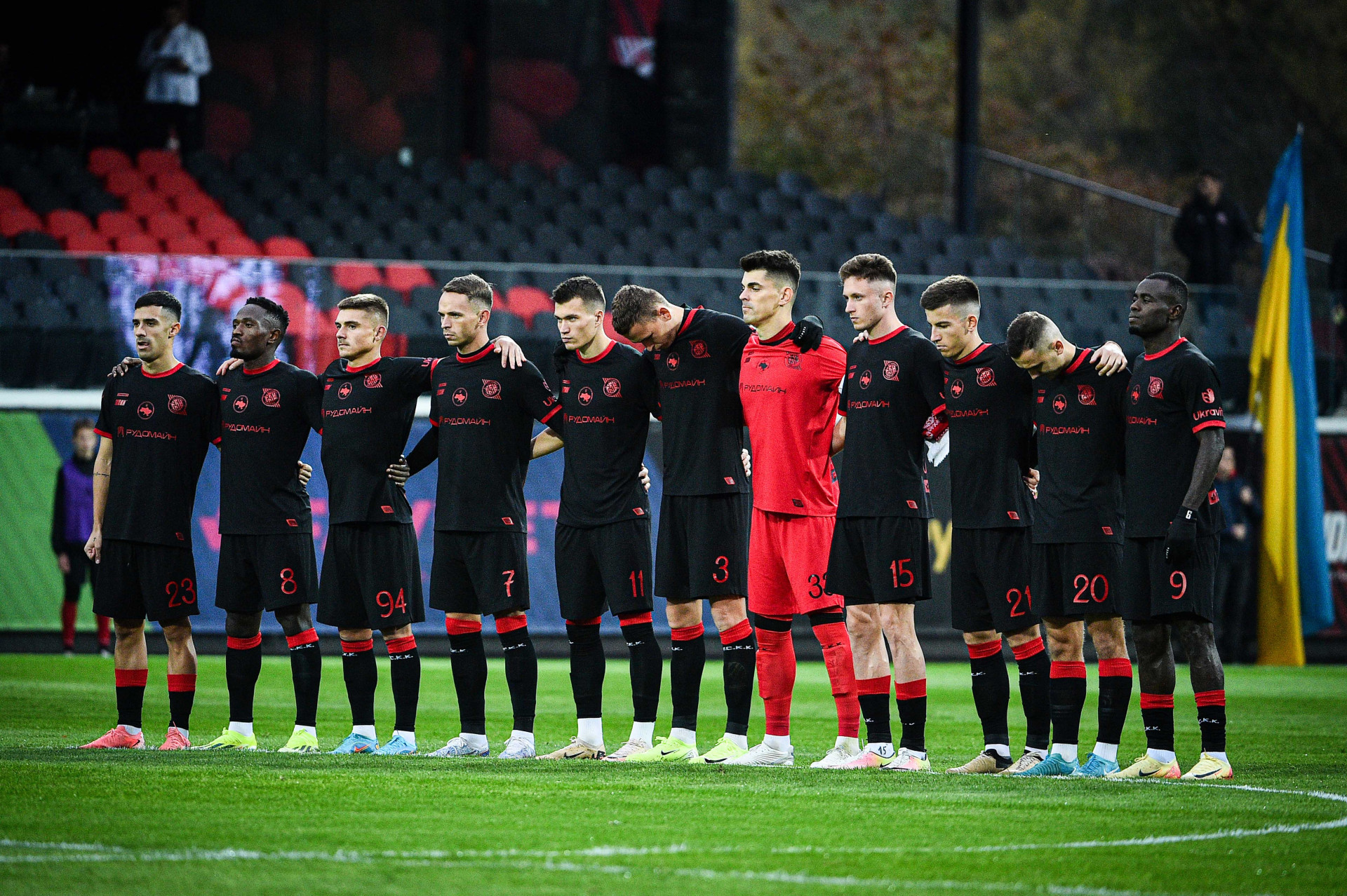
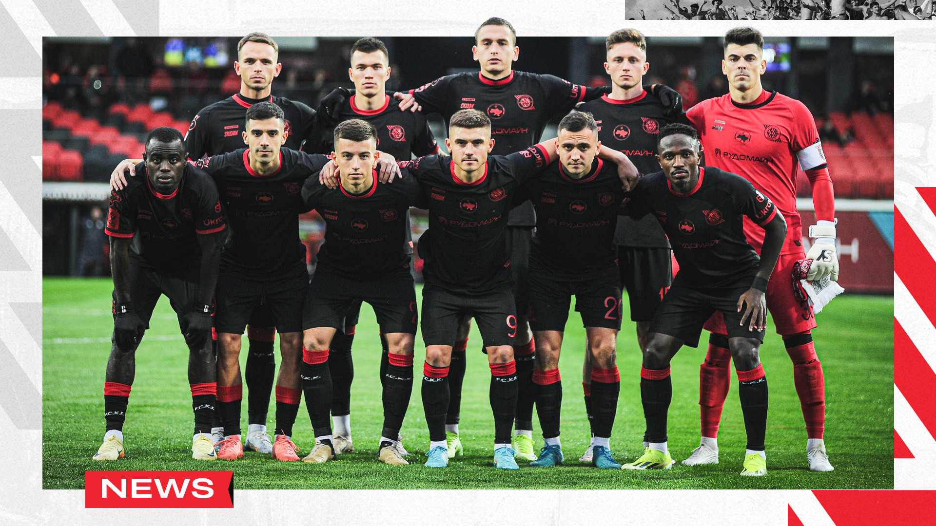
"Kryvbas" went out for a match with "LNZ" in a new set of form
The design of a new form is devoted to the liberation struggle of the Ukrainian people for independence. The resistance that lasts not three, not ten years in a row ... And for centuries. We are sure that only the red-black flag of the struggle will lead to a blue-yellow flag of freedom !
That is why the main colors of the new Jersey became exclusively black and red. These two colors symbolize the Ukrainian land and the blood of fighters shed on it in the struggle for the freedom and independence of Ukraine.
buy a new form in a fan shower
The name of the players used a unique Ruthenia font, recognized as a true Ukrainian Cyrillic, which was used in our lands until 1710. Professor Vasyl Chebanyk, the author of the font in 2019, became the winner of the Shevchenko Prize for contribution to the visual identity of Ukraine. Ruthenia or Ruthenian alphabet of the Ukrainian language is based on the traditions of Russia and Cossack cursives. The letters that carry the nation code - Ukrainian visual identity and deep content, laid down by our ancestors.
Lines from the prayer of the Ukrainian nationalist were one of the most important elements of this form. The words of the main text of which were written on the wall of the author of the author of the author Osip Maschak after his detention in 1936. Today this text remains as relevant as almost 100 years ago.
In addition to the already familiar to all the slogan encrypted in the chevron #RP, the coat of arms of the liberation struggle of the Ukrainian nation was used in the form. The triangle in which is a stylized cross, the lower beam of which passes into the blade of the sword, and in the middle is fluttering the trident. This coat of arms as a reminder to everyone that the fight continues ! and it continues to our complete victory !
Media of FC "Kryvbas" Kryvyi Rih
Галерея